BRANDING: San Jose Dance Theatre (SJDT)
San Jose Dance Theatre was established in 1965. It is the original ballet company in the area, holding the longest running Nutcracker production in the area as well. They are known for their professional quality performances and exceptional ballet training.


I was honored to develop SJDT's logomark in 2020. With the addition of a new Artistic Director in 2025, along with some specific events & goals to highlight from this point forward, it was a good time for a slight logo refresh. The subtle changes allow for a smooth transition from the 2020 version into the now, saving money and time on reprints that would be immediately necessary with a more dramatic rebrand.
Logo Concept
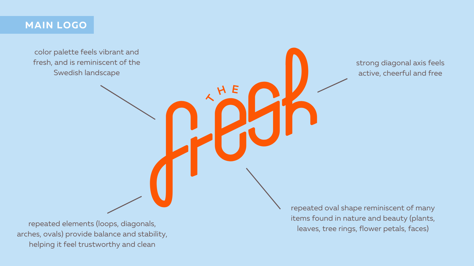
LETTERS: The key letters S, J & D can be found within the logo mark
MOVEMENT: The expressive quality of diagonal lines conveys movement
MUSIC: The logo is reminiscent of a treble clef, signifying the important role music plays in partnership with dance
INFINITY: Abstracted infinity symbol represents the constant cycle of training that ballet requires, as well as perpetual alumni involvement
“Everyone is very happy with the design. Thank you!”